Prologue
The BrainHealth Project offers a revolutionary approach to brain wellness, grounded in decades of scientific research. We believe the brain is a dynamic organ capable of improvement throughout life. Through our multidimensional framework, we explore how to enhance brain fitness at every stage.
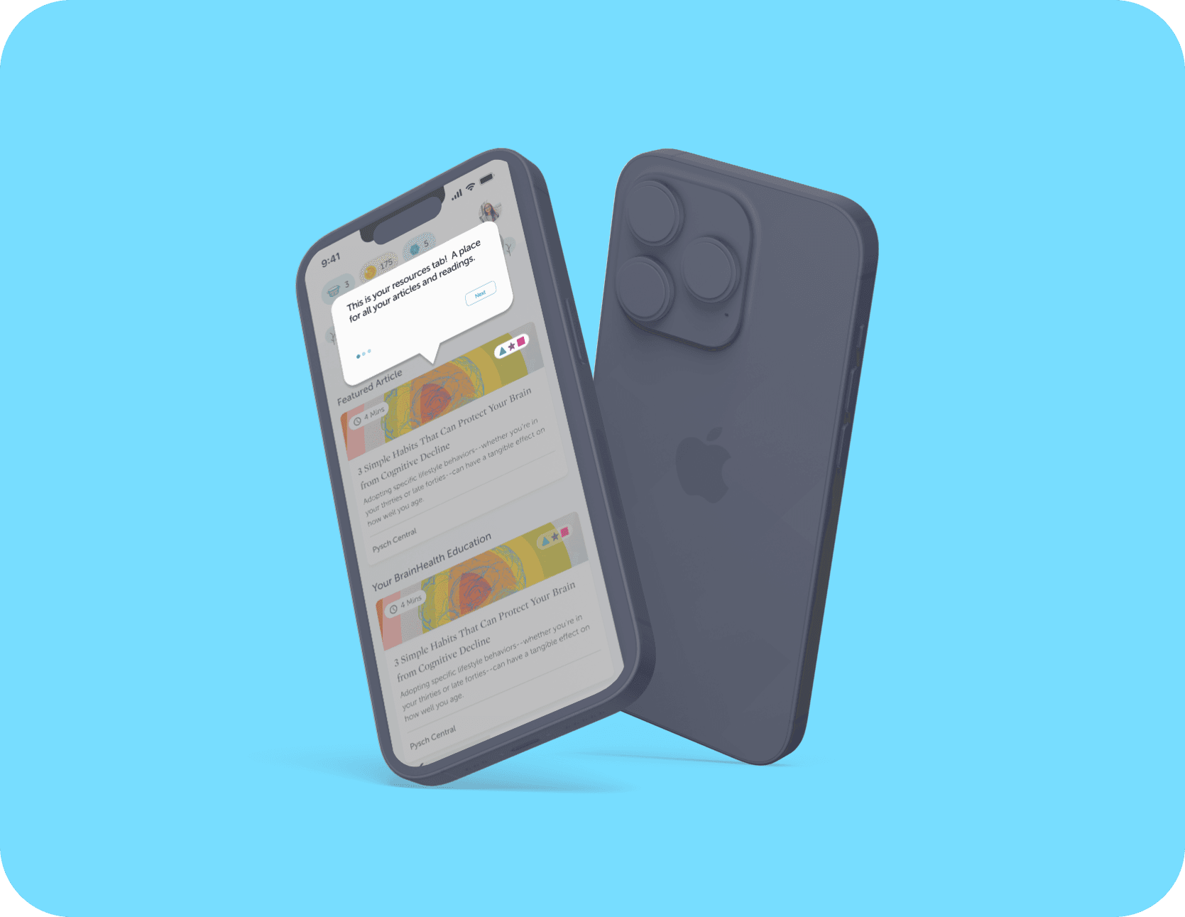
As a UX designer, I undertook a project to enhance the user experience of a brain health app, specifically targeting the resources tab. Through user research, I discovered that the shapes used in the articles were confusing for users. This case study outlines the process, findings, and design solutions I implemented to address these issues.
The Problem
User retention after the first 6 months was witnessing a drastic drop-off. In order to find a solution to this, we had to come up with a project plan.
After conducting intensive user research, one of the main pain points that users were experiencing was the confusing layout of the application and the hard-to-navigate resources section.
Key Findings
User Confusion: A significant percentage of users found the shapes confusing and were unable to interpret their meanings correctly
Need for Legend: Many users suggested including a key legend to decode the shapes
Collaborative Brainstorming: Worked with the main designer to generate solutions, with consensus on introducing a key legend alongside the shapes
Prototyping: Created high-fidelity prototypes incorporating the key legend
Research
During the research phase, I tested the application, conducted user interviews, compiled my findings, collaborated with the team, and began iterating the design of the solution.
User Interviews
Conducted interviews with a diverse group of users
Gather qualitative insights on user experiences with the resources tab
Explored user perceptions, pain points, and suggestions for improvement
Iteration
Began designing a legend to explain the shapes
Ensure the legend blends seamlessly with the interface
void detracting from the overall user experience while enhancing clarity
User Painpoints
User Feedback: Users reported confusion regarding the shapes present in the articles under the resources tab.
Intended Purpose: These shapes were designed to represent different concepts.
Identified Issue: The lack of a clear legend made it difficult for users to understand the meaning of the shapes.
Impact: This confusion negatively affected the overall user experience and comprehension of the content.
The Final Design
Revised Approach: Decided to implement a dedicated legend button for easy reference as needed
Design Consideration: Positioned the legend in a way that is noticeable without disrupting ease of navigation or flow
Final Placement: Included a prominently placed key legend at the top of the articles under the resources tab
Enhanced Clarity: Each shape was paired with a brief description to ensure quick and easy understanding for users