Background
The BrainHealth Project offers a revolutionary approach to brain wellness, grounded in decades of scientific research. We believe the brain is a dynamic organ capable of improvement throughout life. Through our multidimensional framework, we explore how to enhance brain fitness at every stage.
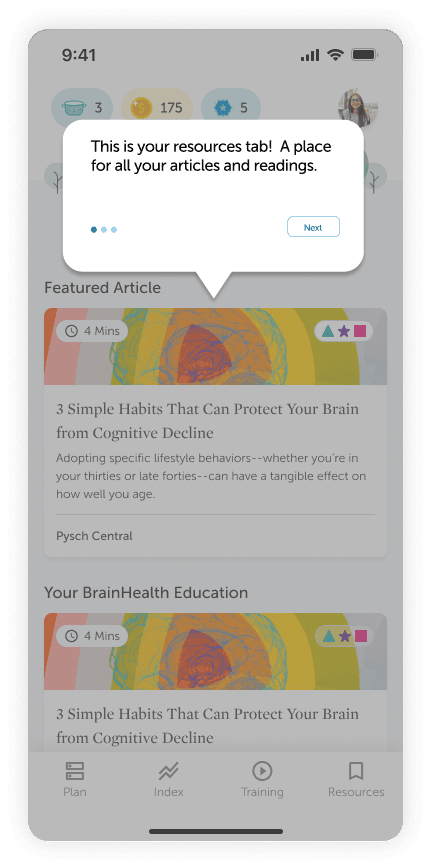
As a UX designer, I undertook a project to enhance the user experience of a brain health app, specifically targeting the resources tab. Through user research, I discovered that the shapes used in the articles were confusing for users. This case study outlines the process, findings, and design solutions I implemented to address these issues.
Research & Planning
After conducting extensive user research on the application, one of the primary pain points identified by users was the shapes that appeared on the articles within the resources tab. These shapes caused confusion regarding their meaning, resulting in a frustrating experience for users.

User Pain Points
User Feedback: Users reported confusion regarding the shapes present in the articles under the resources tab.
Intended Purpose: These shapes were designed to represent different concepts.
Identified Issue: The lack of a clear legend made it difficult for users to understand the meaning of the shapes.
Impact: This confusion negatively affected the overall user experience and comprehension of the content.
Design Process
Research
User Interviews
Conducted interviews with a diverse group of users
Gather qualitative insights on user experiences with the resources tab
Explored user perceptions, pain points, and suggestions for improvement
Survey
Distributed a survey to users
Collect quantitative data on user perceptions
Evaluate the effectiveness of the current design elements
Identified measurable trends and areas needing improvement
Iteration
Began designing a legend to explain the shapes
Ensure the legend blends seamlessly with the interface
void detracting from the overall user experience while enhancing clarity
Key Findings
Main Takeaways
User Confusion: A significant percentage of users found the shapes confusing and were unable to interpret their meanings correctly
Need for Legend: Many users suggested including a key legend to decode the shapes
Collaborative Brainstorming: Worked with the main designer to generate solutions, with consensus on introducing a key legend alongside the shapes
Prototyping: Created high-fidelity prototypes incorporating the key legend
DESIGN
Key Design Change
Revised Approach: Decided to implement a dedicated legend button for easy reference as needed
Design Consideration: Positioned the legend in a way that is noticeable without disrupting ease of navigation or flow
Final Placement: Included a prominently placed key legend at the top of the articles under the resources tab
Enhanced Clarity: Each shape was paired with a brief description to ensure quick and easy understanding for users
Key Lesson
Highlighted the importance of user-centered design and iterative testing
Approach
Leveraged user feedback and data-driven design decisions to improve the interface
Future Commitment
Prioritize clarity and user comprehension in all design elements moving forward


